Perspectives #15
Perspectives Critiques are photo critiques that were made independently from one another. The critiques are not seen until they are all published together. It's interesting to see the similarities and differences in the critiques.
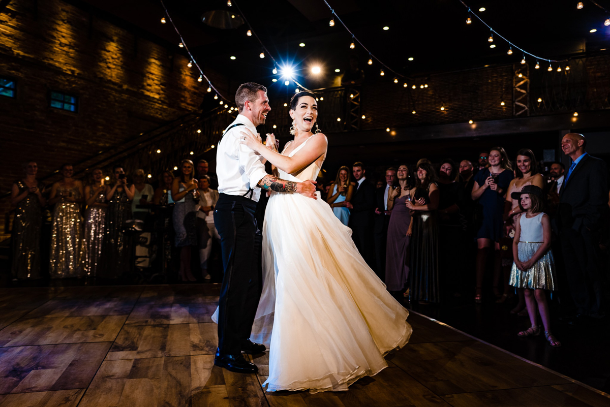
Thank you for sharing your thoughts on this photo!
Aditya Grandhi:
It's beautifully lit. The key light seems to be just to the camera right up high as seen by the grooms' shadow cast behind him. I could do without the video light (?) in the background as the blue/orange lights in the background are a bit distracting. It's nitpicking though.
I love the string lights in the top right and even though they aren't there on the top left, the ceiling lights do a good job of providing interest. The mass of people seems skewed to the right but the visual weight of that right side is somewhat balanced by the two shiny dresses on the left side. Not having as much floor space vacant to the left would've helped even more. Maybe moving a bit to the left following the circle centered on the couple would've fixed the off-kilter perspective. The moment and expressions of the bride/groom/all the guests are spot on and tell the story.
Kathryn Cooper: I'm enjoying the joy here! Without knowing the photographer's style, I can only comment to how I would have done it different, and I think this shot could benefit from a few simple ideas.
First, I'd make it more colorful/vibrant to match the mood. Second, I actually really like the shimmers of the bridesmaids, and would bring it up a bit. I'm sure others would rather it not distract, but I believe the sequins bring another element of excitement to the photo. After that, I'd dim the warm light right above them and leave just the blue light as it's perfectly centered above them.
The fact that there are very few phones in the shot is wonderful, and I'd like to see the audience more because of it. As for the bride--does she have short hair? Seeing that personality come out by lightening the shadows around her head could help. All in all, it's a fun shot that really captures the fun mood of the night.
Carlos Porfírio:
This picture shows us probably a moment of the couple's first dance. The couple seems to be playing with each other; these picture moment transmit us the couple complicity as well with their guests that assist behind.
Personally what I consider to be less interesting is the composition in the left side of the image; they are both looking to the right side, "forcing" us to believe that the important part of the story is in the right side, once we can also see people in their back right side, smiling. I would try to crop proportionally the image from the left top side, until the height of the crop be just near of what seems to be a flash star light in their back, cutting the excessive air in the top, as well to eliminate the left side with the bridesmaid? and as well and possible some floor (which is too bright) - if the raw image / pixels allow to. Now, the final picture will gain more impact and connection between the couple and guests on their right side.
Nel van Huyssteen: The highlights of the groom's shirt has to be toned down. Then the overall exposure of the bride and groom is overexposed in relation to the background. Perhaps reduce the bride and grooms exposure and tweak their white balance towards the warmer side.
I always feel when using OFC the subject and background should share a visual atmosphere. Also I feel the lights above the couples heads are distracting because they are super bright. Either tone them down or clone them out.
Composition-wise the couple are too central for my liking. I think a frame with them placed left of the viewer would be more effective.
Damion Mower: Composition - I feel like the left hand side of the image as you look at it is not adding anything to the story. Therefore a tighter crop to the groom would help the frame and in doing so remove the weaker central composition of the couple.
Lighting - They look over exposed in relation to the rest of the scene, it feels like the exposure needs better balance across the image. I would explore lifting the exposure on guests, to bring them into the story. I would also explore burning the bride and groom exposure a little.
Moment - This feels like the moment after the moment. The groom is very rigid and this does not lend much movement to the image

