Perspectives #4
In this innovative exercise, some of the top wedding photographers in the world were asked to critique the same wedding photos independently on their own without knowing what the others think. Would they agree? How different or similar would their critiques be?

Steven Rooney | Education
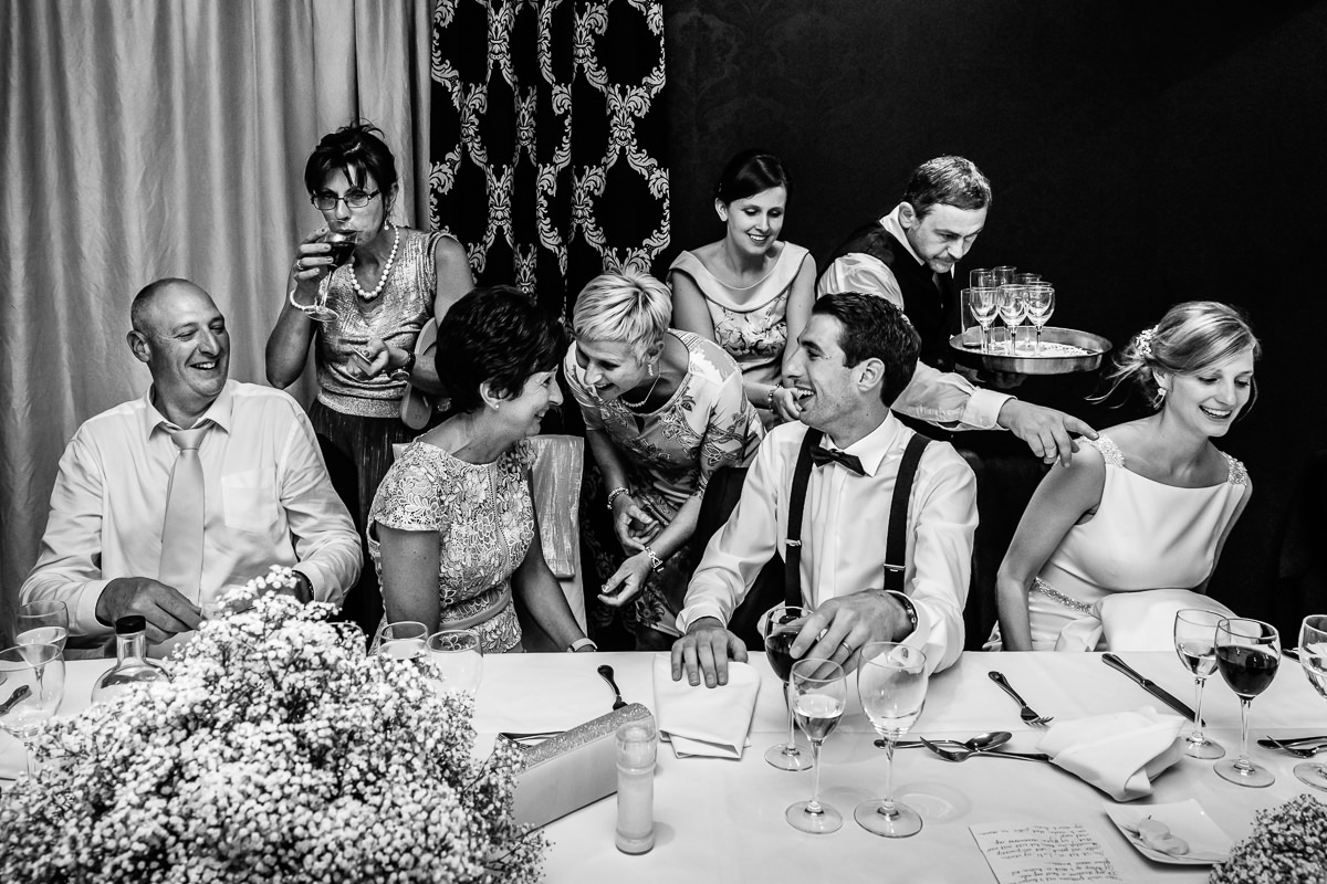
When we're trying to line up compositions like this one, it's quite rare that you would get peak emotion with the perfect composition and all the components in the right place or framed in the right way. In this case, we have our subjects well framed within the picture. It has good breathing space around the outside, and we can see interactions and action here. And we've got little triangles. If you follow the lines of the people's faces, we have little triangles there, which is strong compositionally on the top half of the frame, which I would expect to see.
The only downside to this picture, there's no peak emotion. I would say that it's a good storytelling image. It's a good transition image. It will bring the viewer in a set of images from the speeches through to the evening reception. It's got all the important people in it. The bride on the right hand side of the frame isn't adding much to the image apart from the composition itself.
In terms of improving this image, the only thing that I may suggest is that the photographer to get in a little bit closer with a wider lens to keep the important people in the frame and just wait and be patient for some more peak emotion - a big laugh, a hug or something like that, just to show that connection. The other thing worth mentioning here might be that other than the lady drinking the wine, it's difficult to see anyone's eyes. It might help to see eyes to bring more feeling or emotion out of the image.
Melissa Suneson
This is a very interesting photo. The photographer is trying to tell different stories in one scene. We see different groups of people engaging in different actions. This makes it a complex photo. So when we start analyzing the photo we try to find the main story and the main actors. Or maybe there are different stories between one photo. What does the photographer want to show? The group in the center is the group that is more engaged between them. The people around that group in the center are less engaged. At least three people are looking down. The eyes are very important in the photo. Having those three people looking down makes them lack engagement in their own groups and with the people around them. The couple on the left is half engaged. The lady on the right with a waiter and the other lady are also halfway in the engagement. So we're not sure. The photographer should work the scene more and just staying there. Maybe she could capture those people around having more engagement with the people next to them or with a group in the center. We have to think what we want to capture.
Sometimes things work out and sometimes they don't. I compliment the photographer for trying to find and capture different stories in one scene and to keep on working this kind of scenes, which are complex, but when they work, they turn into a great photo.
Mauricio Arias
Why does this photograph work? Because it has balance. It has different elements happen at the same time. It's a good moment. It talks about this space and who they are and what was going on and what's the relationship between the people in the picture. I like the different layers. It shows the photographer is capable of access, being very aware of timing at the same time not interrupt anything between people. It's a good photograph. No, it's not an exceptional photo. This is about having composition, good light and good luck. I will wait or a better moment in this composition. We'll wait for it a more obvious entrance point and more - even more louder or more quieter.
Paul Tansley
Another great image. I really like what's going on in this picture. There's so much to look at. What could I improve about it?
There's a lot of white going on which is distracting from the faces. So what I did when I was playing around with this image, I just darken down on the bottom edge of the table. Then I darkened down the shirt on the left just a touch. I also darkened down the waiter's head. He's probably one of the brightest things in the image but he's the least important thing is in this image because he's just the waiter. We're darkening down those factors so more emphasis comes onto the faces which I think are the important things in this picture.
I would love to see the before and afters of this scene. I wonder whether the photographer carried on shooting because it's a real pity that the bride has such a beautiful smile on her face but she's actually pointing out of the picture and it isn't really involved in the picture.
I'd love to know what went on after the waiter went away. If there was still a bubbly atmosphere going on, that would have made another great shot. But we shall never know. It would have been great if the background would be continuously dark but we can't change that. There's nothing we can do about that. I think the fact that there's three or four little scenes going on here is great. It's a really nice capture.
Patrick Engel | Education
This is nice as well. It's a very nice moment. I wouldn't improve anything except the foreground with a gradient, because it's very bright as well, just a little bit. I wouldn't crop it. I wouldn't do it in color as black and white is fine for this scene. It's nice. It works for me.


